
Melt Curve Analysis: How to Run and Read It Correctly
Melt curve analysis is a post-PCR fluorescence scan that tells you whether your qPCR signal came from the amplicon you designed or from something else. The instrument slowly heats your finished reaction while tracking dye fluorescence, then plots that signal against temperature. A single sharp peak usually means a single, specific product. Extra peaks, shoulders, or broad low peaks point to primer-dimers, nonspecific amplification, or contamination.
That single insight is the reason melt curve analysis has become standard practice in any lab running dye-based qPCR.
- Single sharp peak: likely one specific amplicon
- Extra peak at lower temperature: likely primer-dimer
- Broad, low peak: nonspecific product or degraded template
- Matching peak in your no-template control: contamination, not chemistry
Key Takeaways
Melt curve analysis confirms amplicon specificity in dye-based qPCR by identifying whether fluorescence loss occurs at one consistent temperature or several.
| Point | Details |
|---|---|
| Single peak means specificity | A sharp, Gaussian peak consistent across replicates and absent in the NTC indicates one clean amplicon. |
| Low peaks signal dimers | Primer-dimers typically melt around 70 to 78°C and often show up prominently in the no-template control. |
| Matching NTC peak means contamination | An NTC peak at the same Tm as your positive control points to contaminating template, not primer chemistry. |
| Multiple peaks aren’t always bad | Sequence heterogeneity can produce multi-phase melts from a single, real amplicon. |
| Reagent consistency matters | Mayflowerbio’s dye-based qPCR master mixes support stable, reproducible Tm readings run over run. |
Table of Contents
- What Melt Curve Analysis Measures and Why the Derivative Plot Matters
- Reading Single vs. Multiple Peaks Correctly
- Setting Up Your qPCR Instrument for Reliable Melt Curves
- Troubleshooting Unexpected Peaks and Poor Resolution
- What Reproducible Melt Curve Data Actually Depends On
- Why the “One Clean Peak” Rule Gets Oversold
- A Practical Next Step for Cleaner Melt Curve Data
- Sources
- FAQ
What Melt Curve Analysis Measures and Why the Derivative Plot Matters
Intercalating dyes like SYBR Green or EvaGreen bind double-stranded DNA and fluoresce brightly while it stays intact. As the instrument ramps the temperature upward after amplification finishes, the DNA duplex denatures, the dye releases, and fluorescence drops. That drop isn’t linear. It’s sigmoidal, steepest right around the amplicon’s melting temperature ™, which is why raw fluorescence curves are hard to read directly.
Instrument software converts that sigmoidal curve into its negative first derivative, plotted as -dF/dT against temperature. The inflection point of the raw curve becomes a peak on the derivative plot, and the peak’s position on the x-axis is your Tm. This conversion is what the real-time PCR literature describes as standard practice for turning a smooth denaturation curve into a readable diagnostic signal.
Several variables shift where that peak lands or how sharp it looks:
- GC content — higher GC content raises Tm because G-C base pairs form three hydrogen bonds versus two for A-T.
- Amplicon length — longer products generally melt at higher, though not perfectly linear, temperatures.
- Salt and Mg2+ concentration — higher ionic strength stabilizes the duplex and raises Tm.
- Additives like DMSO — these lower Tm by destabilizing base pairing.
- Secondary structure — hairpins or repeats can produce shoulder peaks unrelated to specificity problems.
Instrument calibration matters more than most people assume. Tm accuracy under well-calibrated conditions runs around ±0.5°C, which sounds tight until you’re trying to distinguish a primer-dimer melting at 76°C from a short amplicon melting at 78°C on a poorly calibrated block.
Reading Single vs. Multiple Peaks Correctly
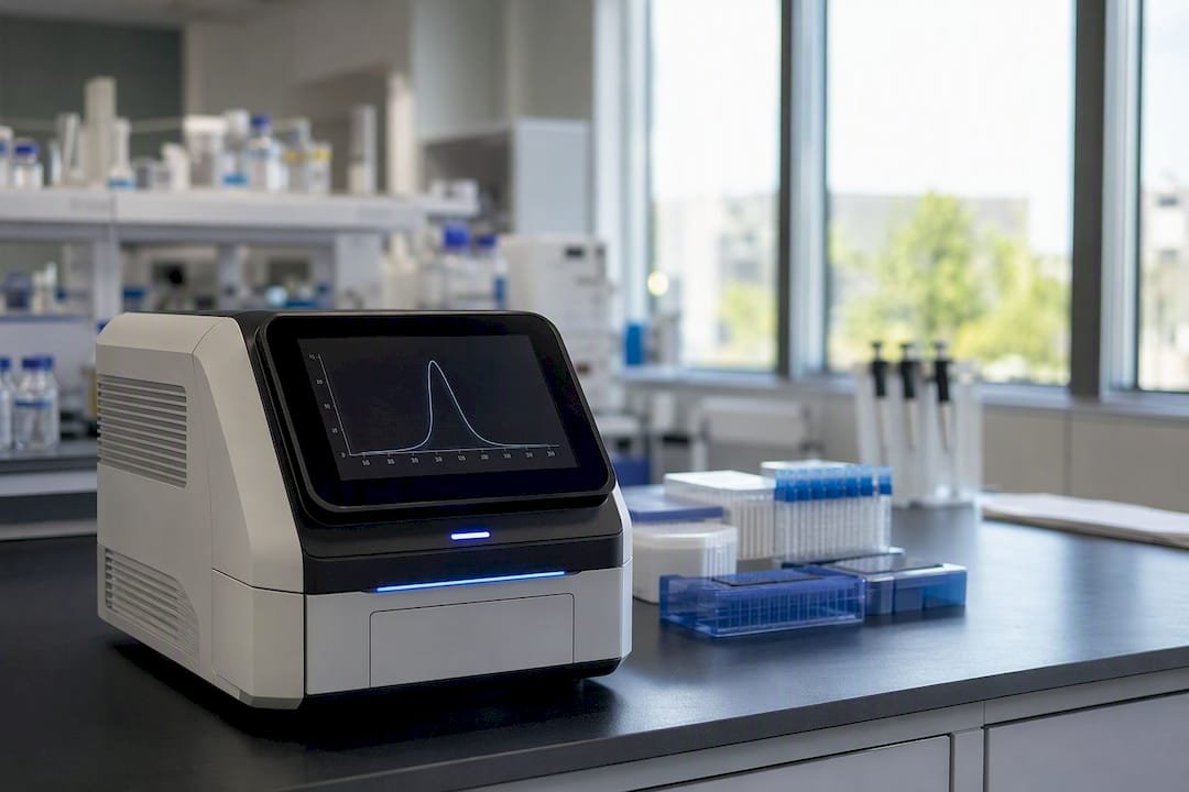
A clean, specific amplicon produces one sharp, roughly Gaussian peak that shows up consistently across technical replicates and is absent from your no-template control (NTC). That consistency across replicates is your first sanity check, before you even worry about the shape of any secondary peaks.
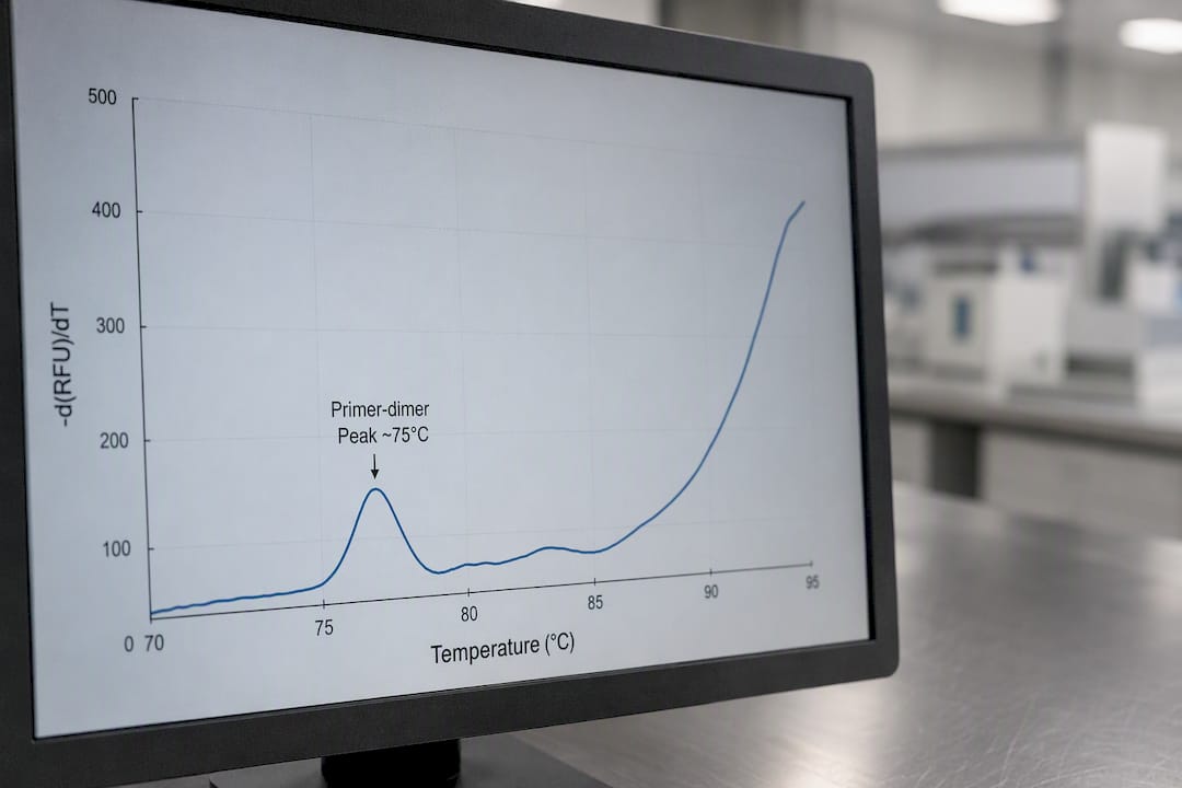
Primer-dimers behave differently. They typically melt at lower temperatures, often in the 70 to 78°C range, and the peak tends to be broader and shorter than a specific amplicon’s peak. If that same low-temperature peak shows up prominently in your NTC well, that’s close to diagnostic: primer-dimers form independent of template, so they’ll amplify in empty wells just as readily as in real samples.
Contamination looks different again. If your NTC produces a peak at the same Tm as your positive control, rather than a separate low-temperature dimer peak, suspect template contamination rather than a primer problem. That distinction changes what you fix: redesigning primers won’t solve a contamination issue, and adjusting your pipetting technique won’t solve a primer-dimer issue.
Multiple peaks don’t always mean multiple products, either. A single amplicon with an internal GC-rich domain or a region prone to secondary structure can melt in phases, producing two or more derivative peaks even when gel electrophoresis shows one clean band. Research on DNA melting prediction models confirms this multi-phase behavior is a real thermodynamic property of sequence heterogeneity, not an artifact.
Pro Tip: Before you assume a second peak means contamination or a bad primer set, run your amplicon sequence through a melting prediction tool. If the software predicts a multi-step melt for your exact sequence, you’ve just saved yourself a redesign you didn’t need.
- Sharp peak, consistent across replicates, absent in NTC → specific product
- Broad peak at 70 to 78°C, prominent in NTC → primer-dimer
- Peak matching positive control Tm in NTC → contamination
- Multiple peaks with a clean single band on gel → likely multi-phase melt from sequence structure, not a real specificity problem
Setting Up Your qPCR Instrument for Reliable Melt Curves
Getting a melt curve you can actually trust starts before you ever load the plate; it starts with the run parameters you choose.
- Temperature range: Most dye-based assays run the melt step from around 60°C to 95°C. Starting too high risks missing low-Tm primer-dimers; ending too low risks missing your target’s true peak if the amplicon is GC-rich.
- Ramp rate: A slower ramp, typically 0.1 to 0.3°C per second, gives cleaner resolution than the faster ramps used for amplification cycling. Faster ramps save time but blur peak shape, which matters if you’re trying to separate two closely spaced Tm values.
- Acquisition interval: Collecting fluorescence data at smaller temperature increments produces a smoother derivative curve. Coarser acquisition intervals can make a real peak look jagged or split.
A few reagent and setup notes matter just as much as the ramp settings:
- Melt curve analysis works with intercalating dyes; probe-based assays (TaqMan-style) generally aren’t compatible with post-run melt analysis because the probe’s fluorescence doesn’t track duplex formation the same way.
- Always run a no-template control and a positive control with a known, previously established Tm for your assay.
- Run technical replicates so a single anomalous well doesn’t get misread as a biological finding.
- Check plate sealing and watch for evaporation artifacts in outer wells, which can shift both Ct and Tm readings on instruments with uneven thermal blocks.
If you’re setting up a new dye-based assay from scratch, a molecular assay setup guide covering primer and reagent selection will save you a round of troubleshooting later.
Troubleshooting Unexpected Peaks and Poor Resolution
Start with the comparisons you already have on the plate before you touch your protocol. Pull up your NTC and positive control side by side with the sample in question. If the sample’s odd peak matches something already showing up in the NTC, you’ve likely found a primer-dimer or contamination issue rather than a biological result. If replicates disagree with each other, that’s often a pipetting or plate-sealing problem rather than chemistry.
Once you’ve ruled out an obvious control mismatch, a few lab-bench adjustments usually resolve dimer or nonspecific peaks without a full redesign:
- Lower primer concentration, since excess primer is the raw material for dimer formation.
- Raise the annealing temperature incrementally (1 to 2°C steps) to improve specificity.
- Switch to a hot-start polymerase if you haven’t already, since it reduces nonspecific extension during setup.
- Adjust Mg2+ concentration, since excess magnesium can promote nonspecific binding.
When those fixes don’t help, redesign the primers. Triggers for redesign include predicted secondary structure in the primer itself, predicted off-target binding sites, or a primer pair that consistently produces dimers regardless of concentration or annealing temperature.
For confirmation before you commit to a redesign, run your sequence through a nearest-neighbor prediction tool like uMelt, which can flag multi-phase melting behavior that would otherwise look like a specificity problem. Backing that up with agarose gel electrophoresis, or sequencing the product if the gel result is ambiguous, closes the loop. If you need finer discrimination than a classical melt curve gives you, that’s the point where high-resolution melting comes in.
Pro Tip: Keep a running log of Tm values for every validated assay in your lab. A shift of even 1 to 2°C from your established baseline is often the earliest warning sign of a degrading primer stock or a reagent lot problem, well before your Ct values start looking wrong.
When You Need HRM Instead of a Classical Melt Curve
Classical melt curve analysis answers a yes/no question: is this amplification specific? High-resolution melting (HRM) answers a much finer question: does this sequence differ from that one by a single base?
HRM requires instruments built for high-resolution optics, saturating dyes rather than standard intercalating dyes, and tighter thermal uniformity across the block than a routine qPCR run demands.
- Use classical melt curves for specificity checks on standard qPCR assays.
- Use HRM for SNP genotyping, mutation scanning, or detecting small sequence variants where a fraction of a degree separates genotypes.
- Validate your instrument’s resolution capability before designing an HRM workflow. Not every qPCR platform can hold thermal uniformity tight enough to resolve single-base differences reliably.
What Reproducible Melt Curve Data Actually Depends On
Clean melt curves come down to reagent consistency as much as instrument settings. A master mix with well-characterized dye chemistry and predictable amplification kinetics gives you a stable baseline Tm run after run, which is what lets you actually trust a 1°C shift as a real signal instead of noise. Mayflowerbio supplies dye-based qPCR master mixes built around that kind of consistency, along with other PCR reagents for labs standardizing their dye-based workflows.
- Choose a master mix with documented, lot-consistent dye chemistry rather than switching dye sources between runs.
- Keep a validated positive control with a known Tm on hand for every assay you run routinely.
- Contact technical support before troubleshooting blind. Protocol-specific guidance on annealing temperature or Mg2+ adjustments is often faster than iterating alone.
Why the “One Clean Peak” Rule Gets Oversold
Most guidance on melt curve analysis treats a single peak as proof of a clean result, and a second peak as proof of a problem. That framing is too simple. The thermodynamics of DNA melting don’t care about your assumptions, a legitimately specific amplicon with an internal GC-rich stretch can produce two derivative peaks, while a genuinely contaminated well can sometimes produce a deceptively tidy single peak if the contaminating template happens to share a similar Tm with your target.
What the evidence actually supports is a comparison-first mindset: your NTC and positive control aren’t optional extras, they’re the baseline every peak in your data set gets measured against. A peak’s shape alone is not enough. A peak in a sample well matched by a peak in the NTC is a much stronger signal than shape or sharpness on its own.
The other place conventional advice falls short is treating primer redesign as a first response. It’s an expensive, slow fix for what’s often a concentration or annealing temperature problem solvable in an afternoon. Reach for redesign only after the cheaper adjustments and a prediction tool have both told you the primers themselves are the issue, not the reaction conditions around them.
— Alina
A Practical Next Step for Cleaner Melt Curve Data
If inconsistent Tm readings keep sending you back to the bench, the fastest fix usually isn’t a new protocol. It’s a more consistent reagent. Mayflowerbio focuses on well-characterized dye chemistry and reproducible master mix formulations, so a shift in your melt curve is a real signal about your sample, not noise from lot-to-lot variability in your reagents.

That matters most for labs running the same assay repeatedly across weeks or months, where a drifting baseline Tm quietly erodes confidence in every result that follows. Mayflowerbio’s PCR reagent catalog covers dye-based master mixes, dsDNA dyes, and related qPCR reagents built for exactly this kind of run-to-run consistency. If you’re standardizing a melt curve protocol across multiple technicians or instruments, browse the other PCR reagents available and reach out to technical support with your specific primer set and target Tm. A quick conversation before you order often saves a full optimization cycle after.
This article is general information, not a substitute for advice from a qualified doctor. Consult a qualified healthcare professional about your own circumstances before acting on anything here.
FAQ
What does a melt curve tell you?
It tells you whether the fluorescence signal in your dye-based qPCR reaction came from a single specific amplicon or from a mix of products, including primer-dimers or nonspecific amplification, based on where and how many peaks appear on the derivative plot.
How do you read a qPCR melt curve?
Look at the -dF/dT derivative plot rather than the raw fluorescence curve. A sharp peak at your expected Tm, consistent across replicates and absent from the NTC, indicates a specific product; extra peaks at lower temperatures or peaks matching your NTC point to dimers or contamination.
What is the purpose of melting curve analysis of DNA?
The purpose is to confirm amplicon specificity after PCR by identifying the melting temperature of the double-stranded product, since Tm depends on GC content, length, and sequence, making it a reliable fingerprint for a given amplicon.
What is the purpose of analyzing the melting curve in RT-PCR?
In RT-PCR, melt curve analysis confirms that the amplified product came from the intended cDNA target rather than genomic DNA contamination, primer-dimers, or nonspecific reverse transcription artifacts, following the same peak-shape and Tm logic used in standard qPCR.
Can melt curve analysis replace a gel to confirm product identity?
Not entirely. Melt curve analysis is a strong first screen for specificity, but ambiguous or unexpected peaks still warrant confirmation by agarose gel electrophoresis or sequencing before you draw a final conclusion.